Brood
Description
Project Challenges
1) Design an organizational app that is appealing and accessible for both child and adult users.
2) Create an inclusive experience for all families.
3) Design a cohesive visual brand identity that reflects the app material.
Timeline
December 2024
Role
UX/UI Designer
Branding
Product Designer
Responsibilities
Research, persona creation, wireframing, information architecture, low and high-fidelity prototyping, conducting usability studies, branding and visual design
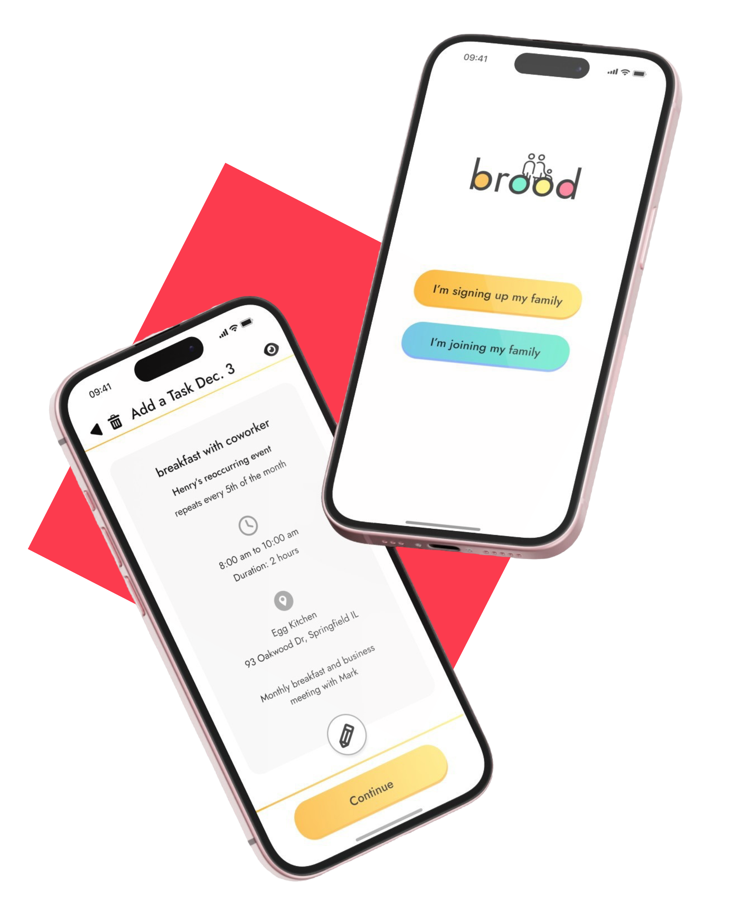
Getting Started
"How can we keep families engaged and connected?"
"How do we cater to both child and adult users?"
"What services do users want in a family-centered app?"
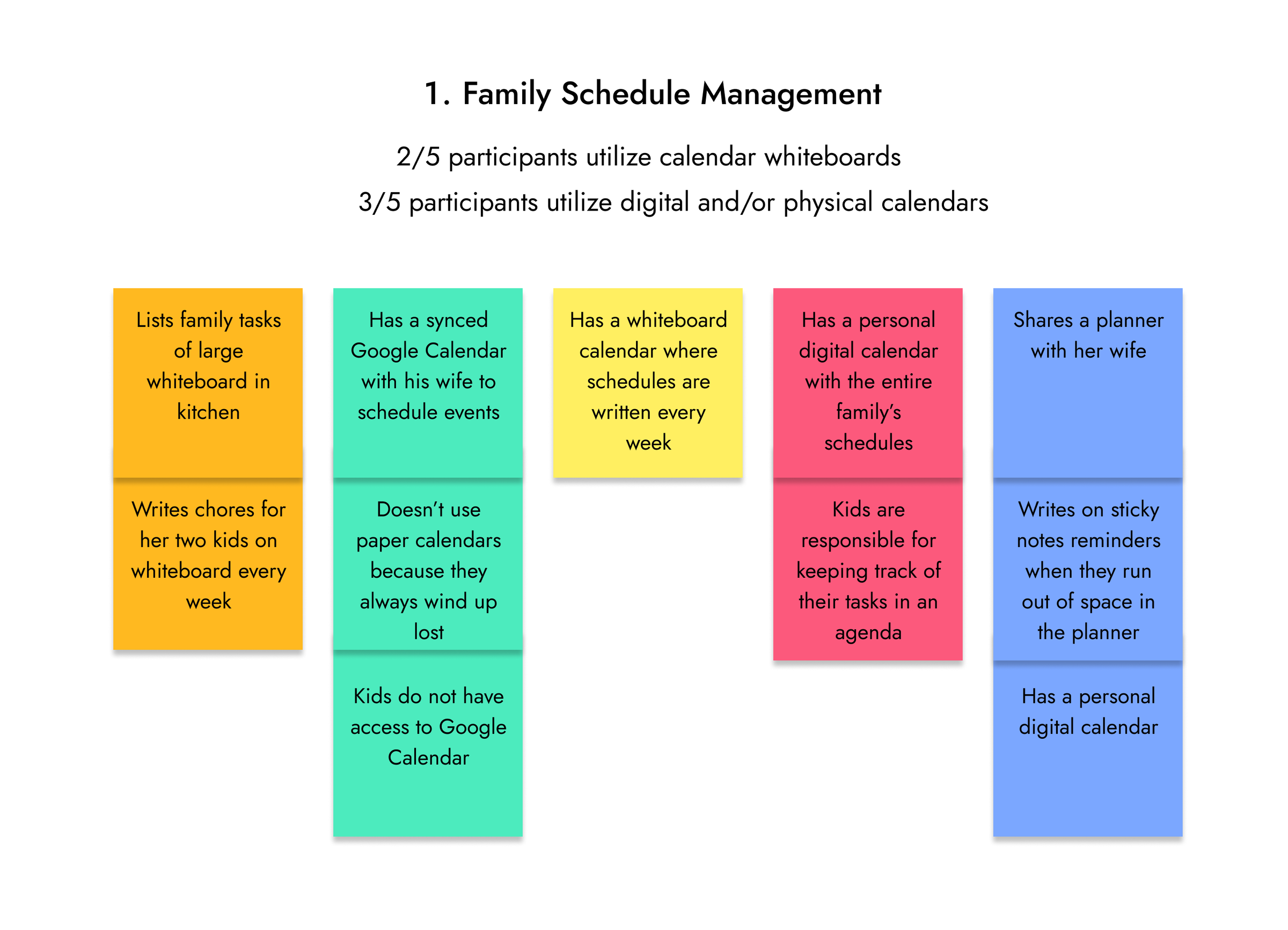
- 5/5 participants write down their family's schedules
- 2/5 participants utilize whiteboards for their family to check tasks and schedules
- 3/5 participants have at least a personal digital or physical calendar
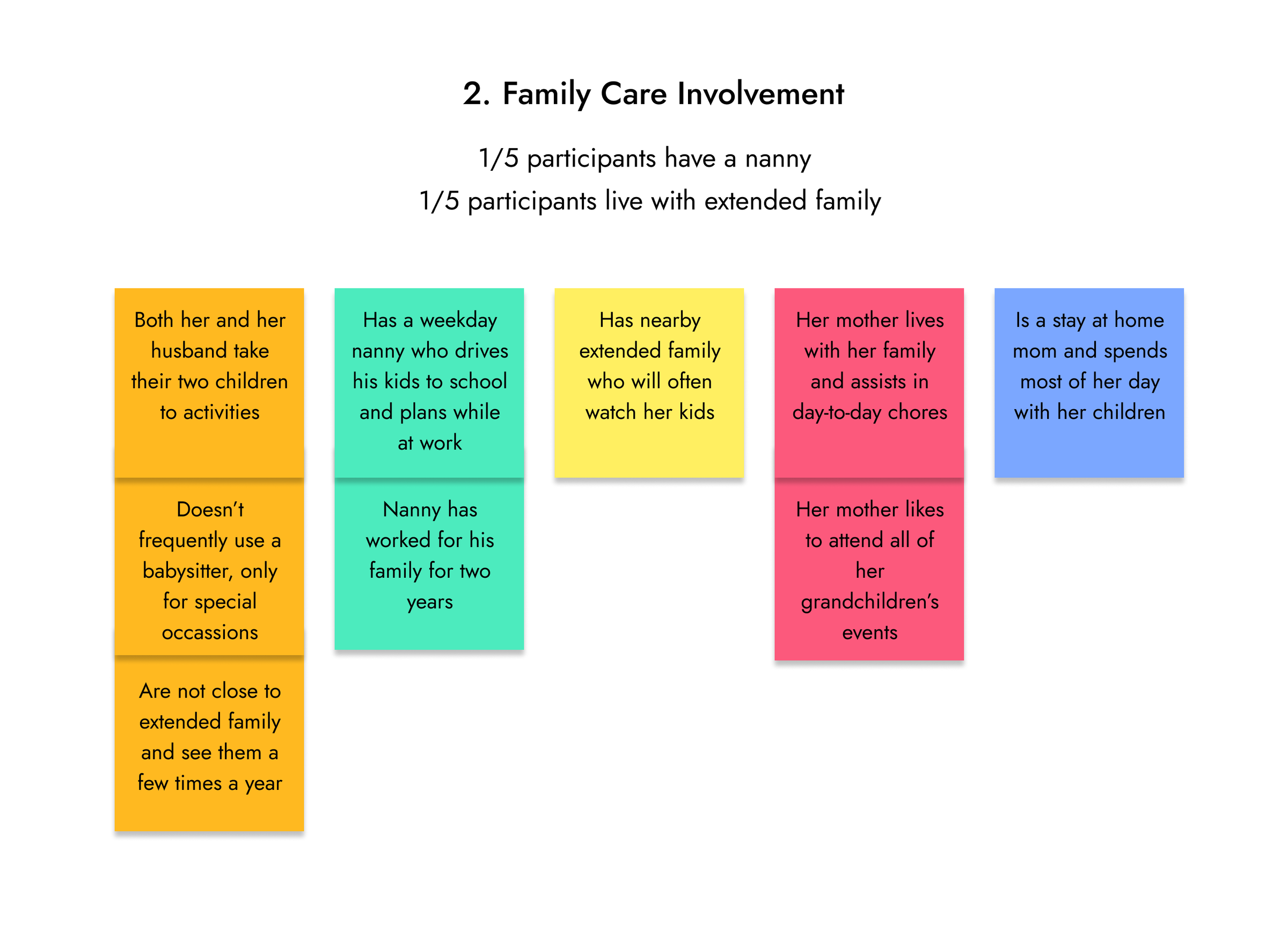
- 5/5 participants need their children to be driven to school and activities
- 1/5 participants have a nanny involved in day-to-day care
- 1/5 participants have and extended family member who is involved in child care
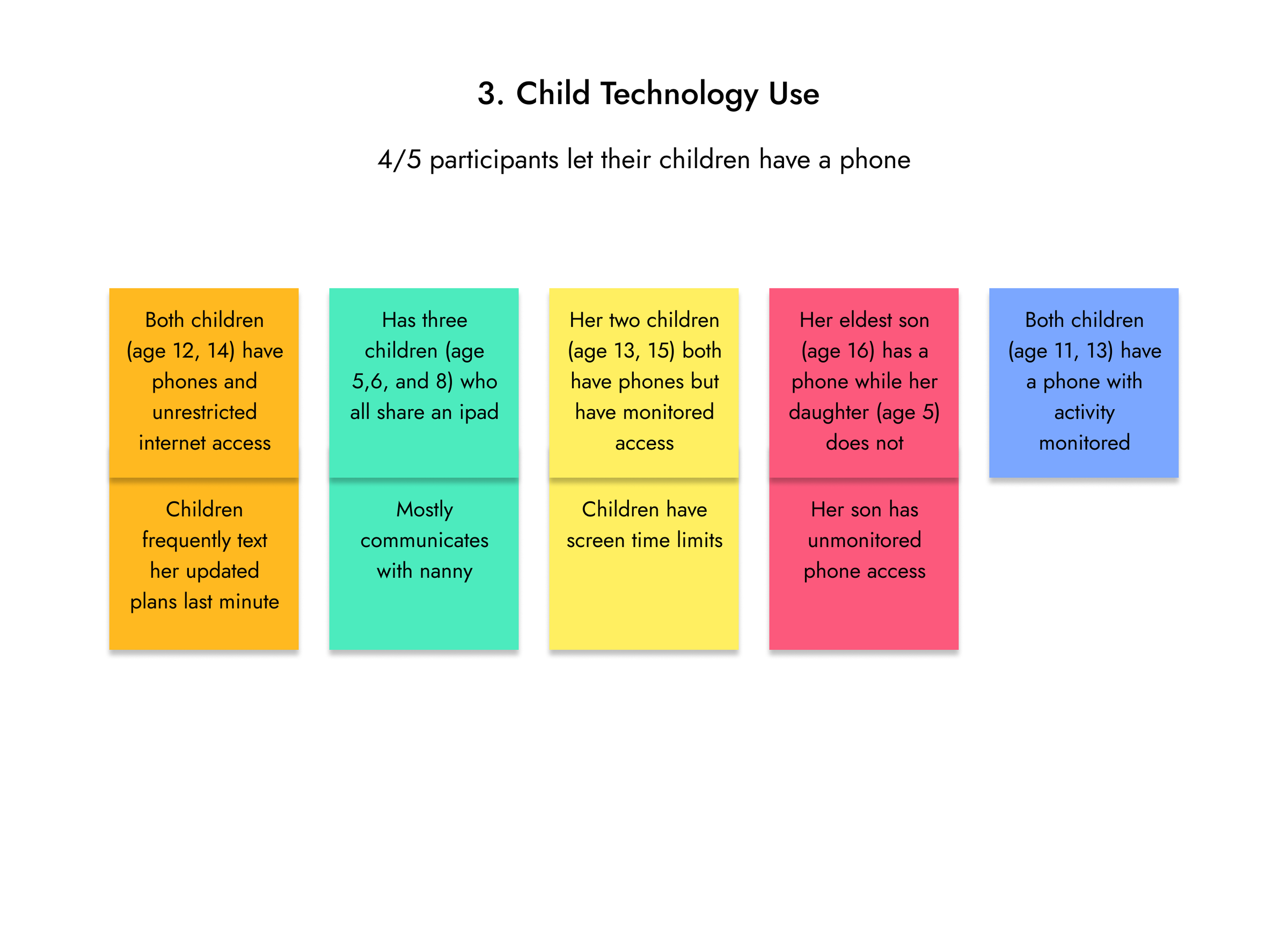
- 5/5 participants have children with access to devices
- 4/5 participants have children who have phones
- 2/5 participants have children with unmonitored phone access
Competitor Research

What can we do different?
Defining
Based on research and data collected from the interviews, we can begin to address our initial research questions.
Keeping Families Connected
Adult and Child Users
Parents want a way to monitor and control child app access and controls. Young children aren't trusted with unlimited phone use.
Desired Services
Personas
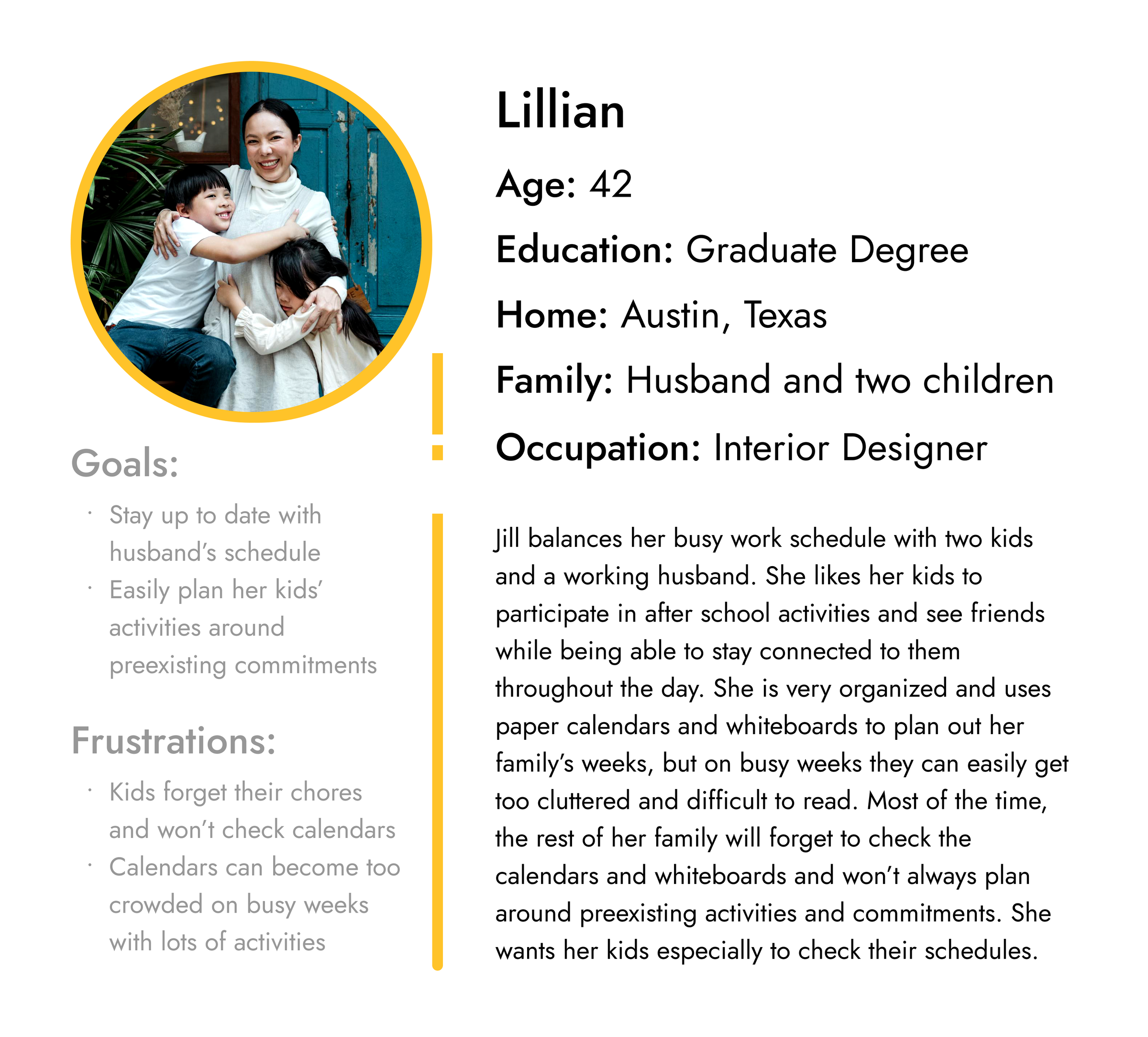
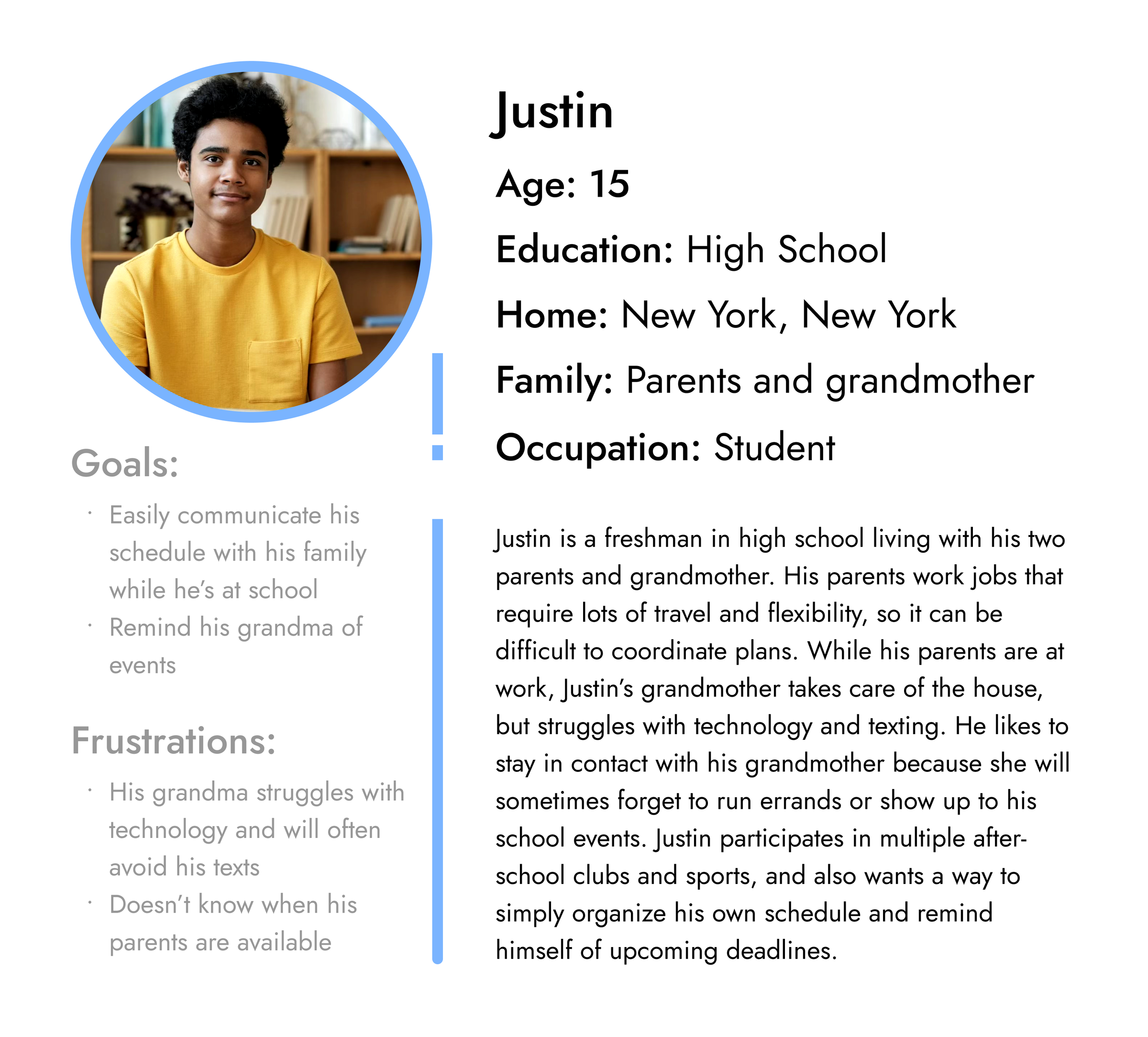
In order to better empathize with users, I developed personas based off of the primary user groups.
Beginning to Design
Information Architecture
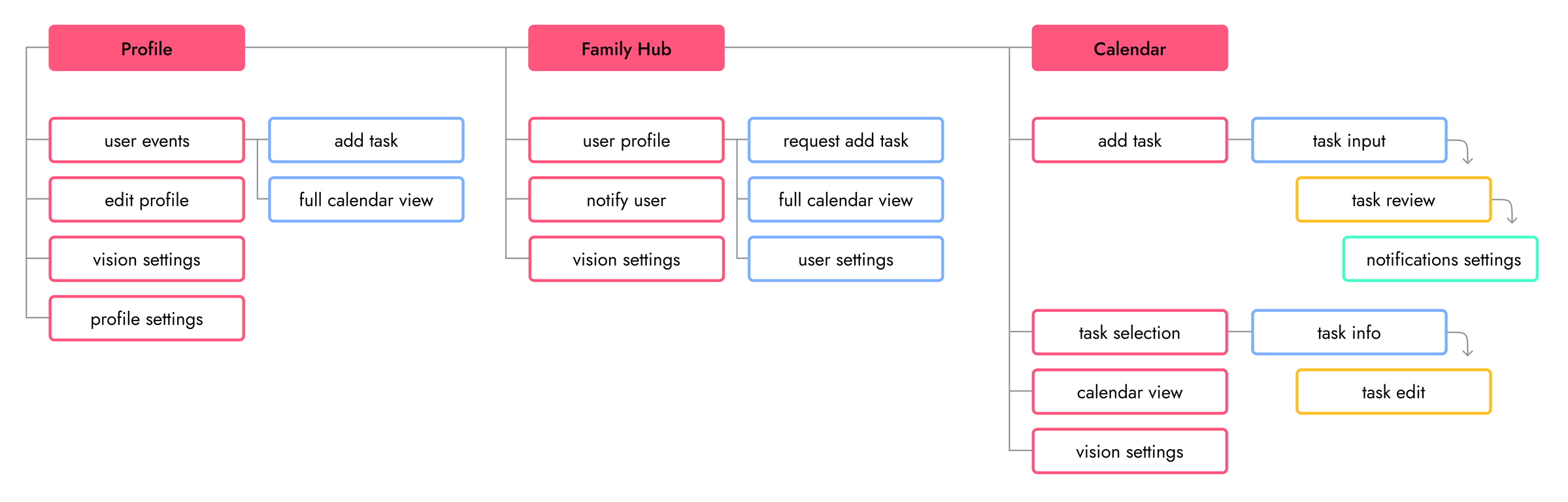
At the start of the design process I developed an initial sitemap of key features I wanted included in the app.
Putting Pen to Paper
After getting a sense of basic user flows, I started sketching wireframes to begin building a visual format for the app.


Iterating and Iterating
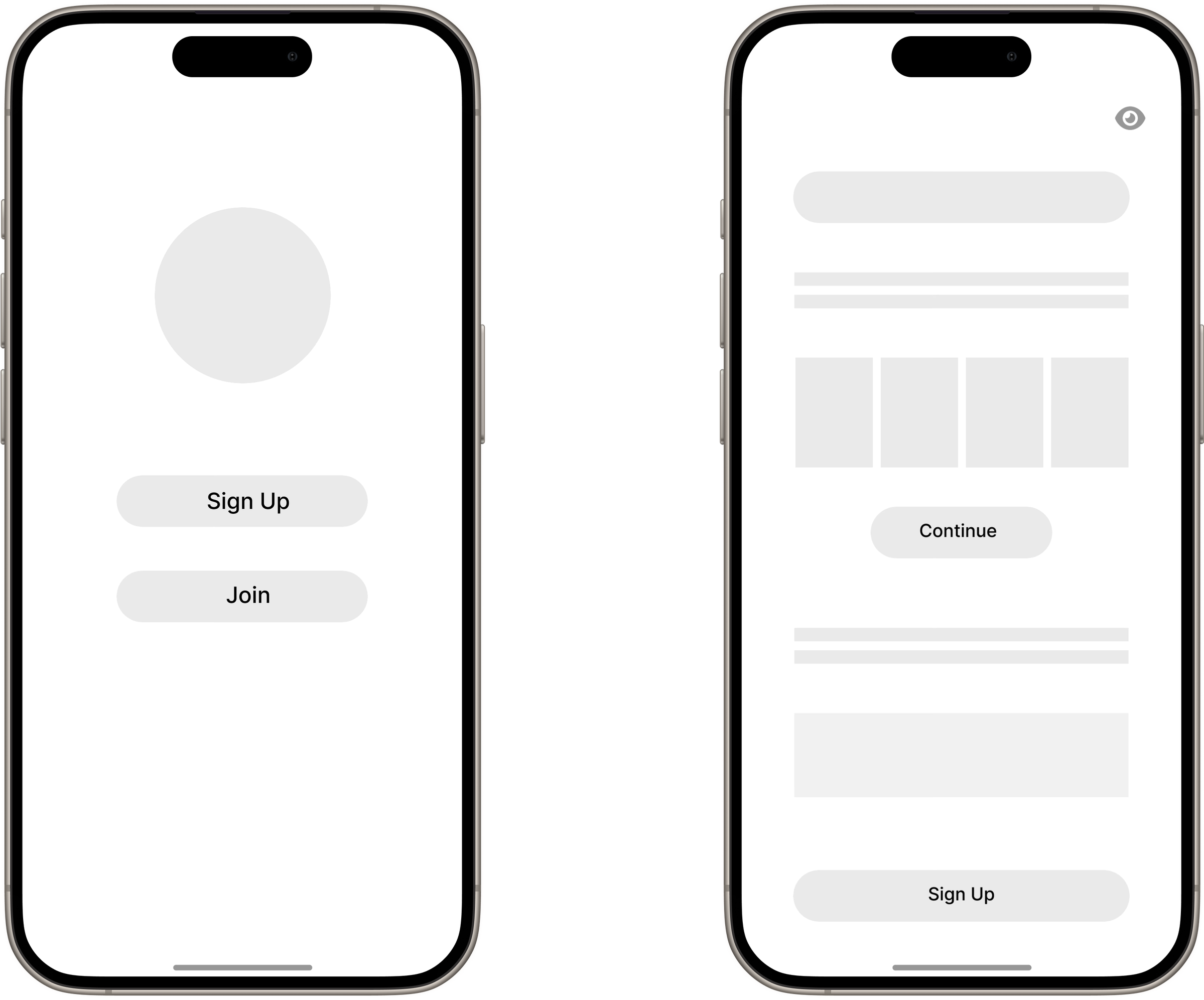
After creating plenty of paper variations, I began to digitize my drawings.
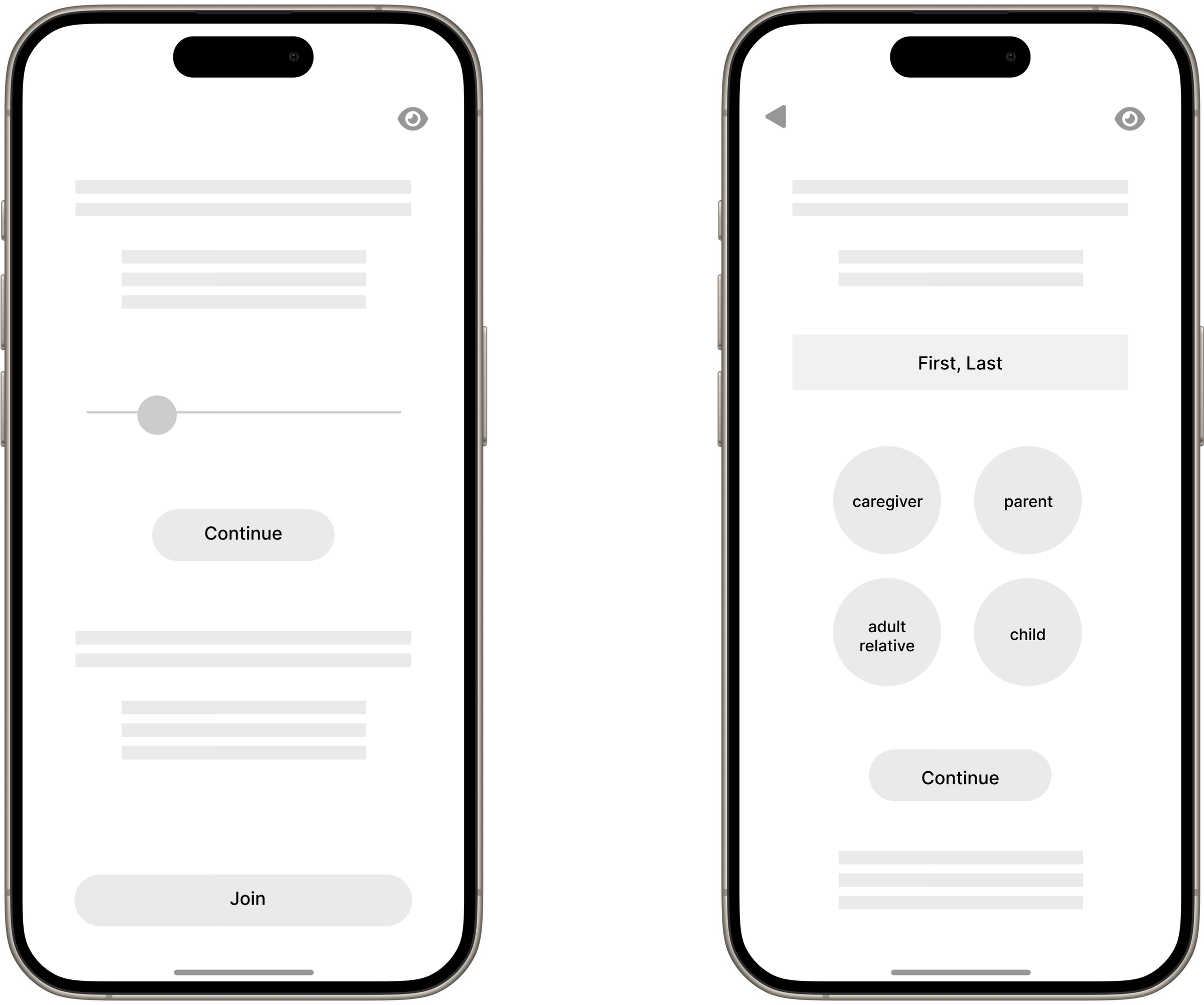
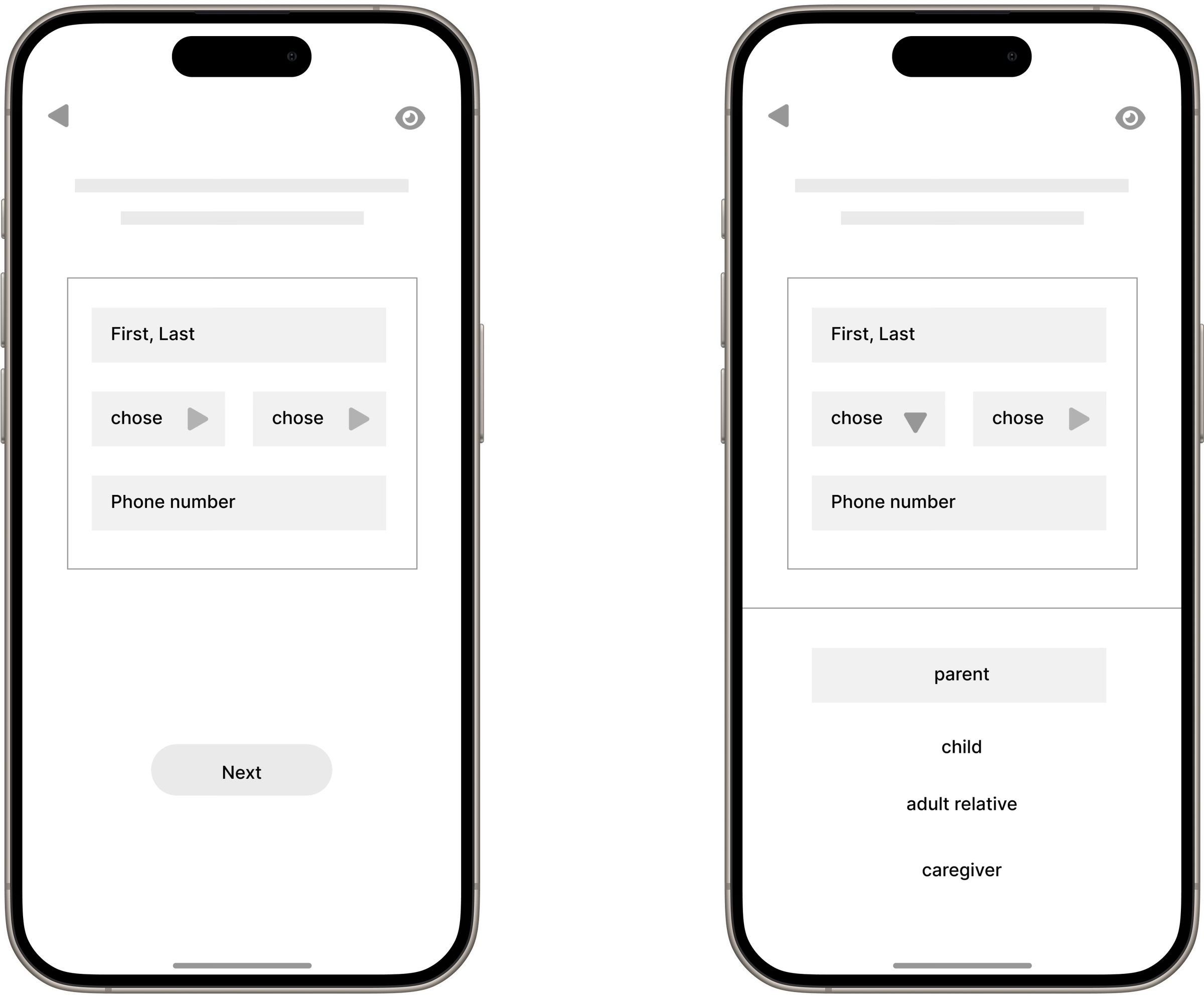
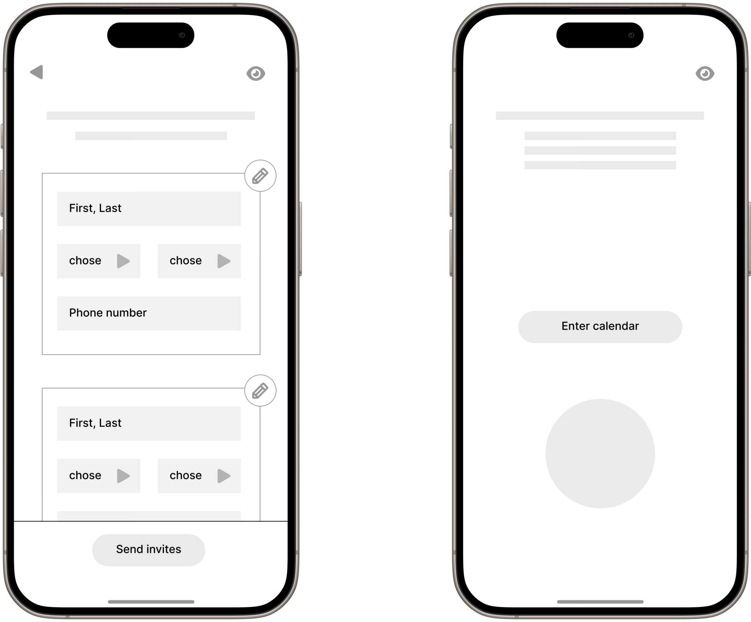
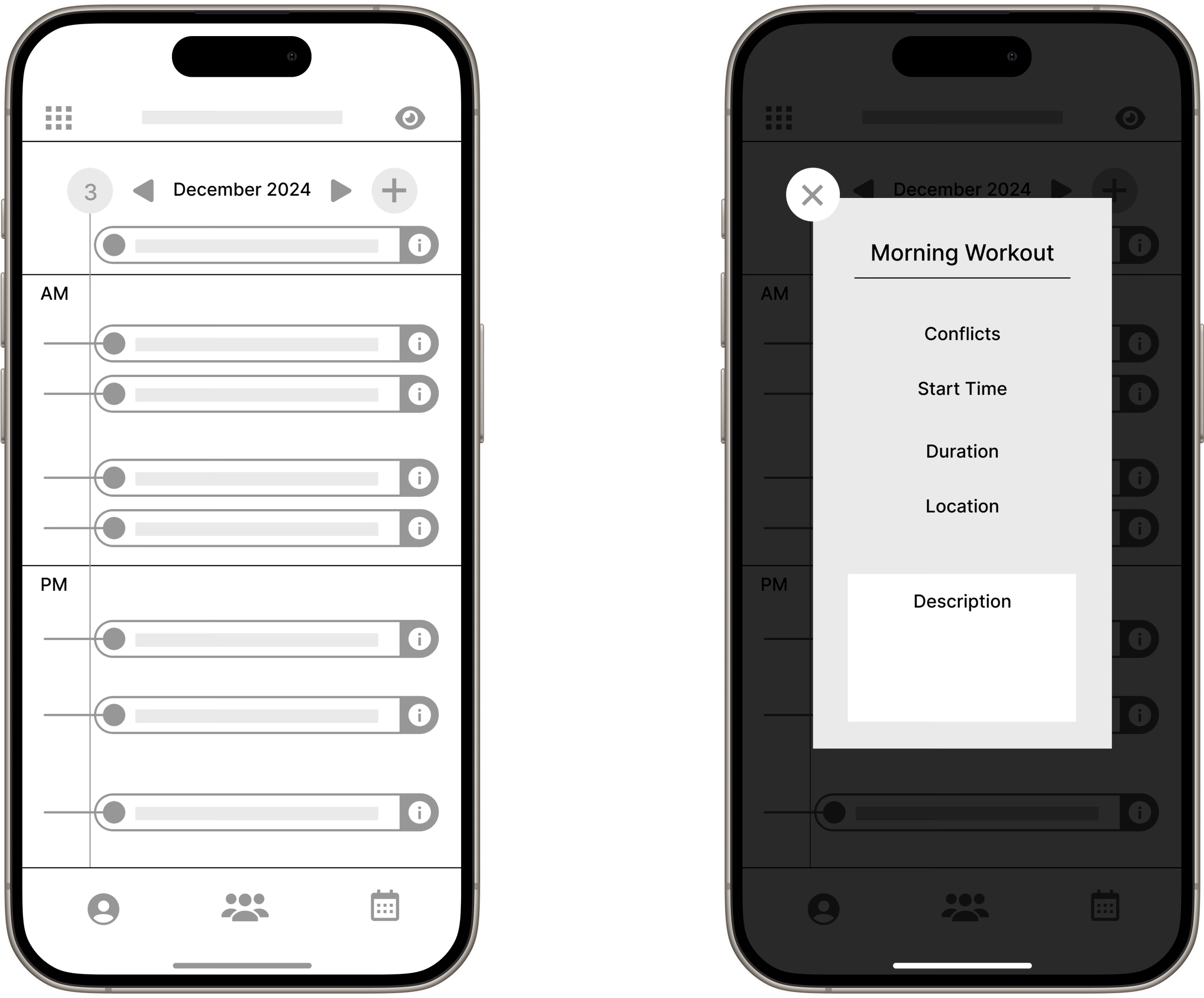
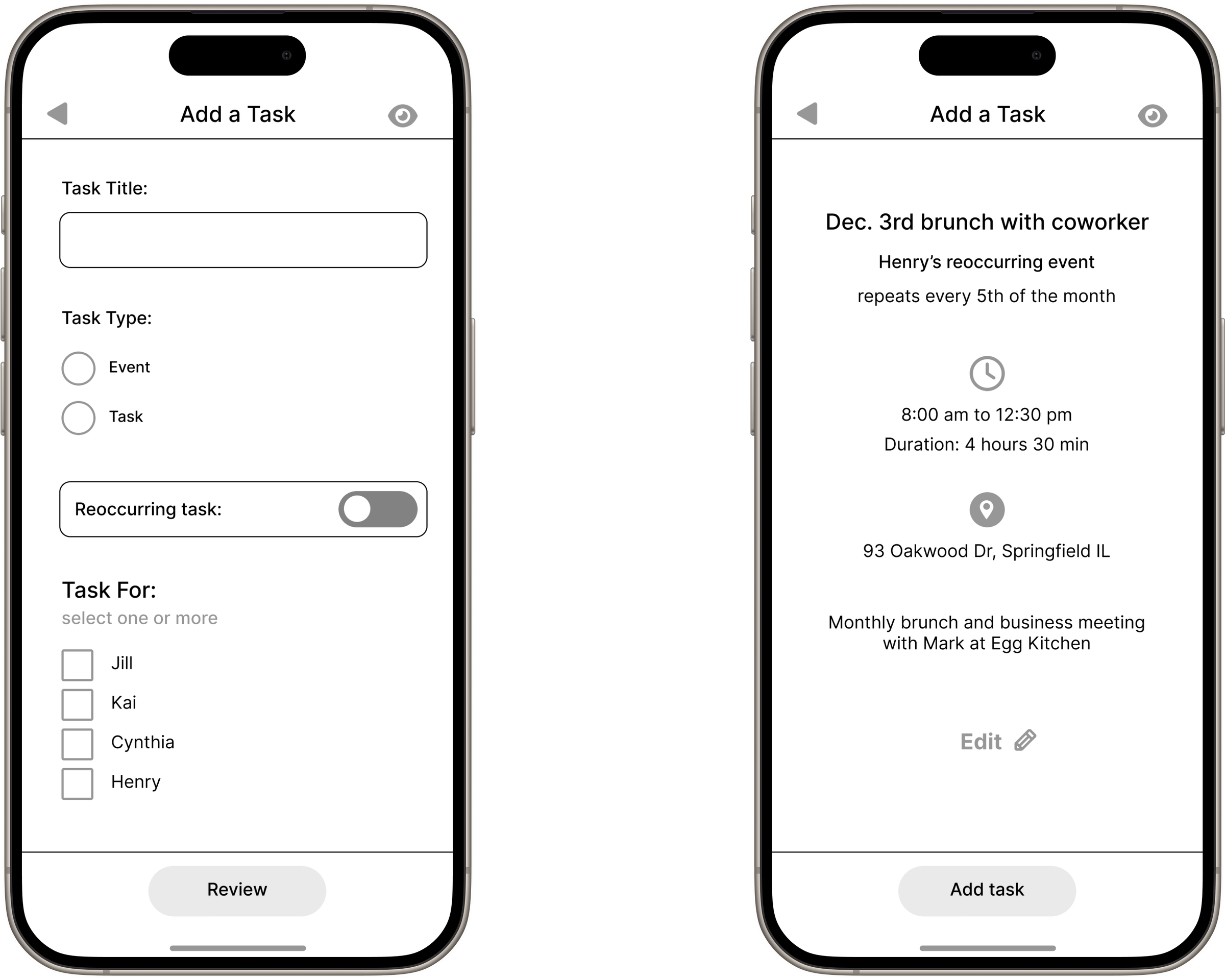
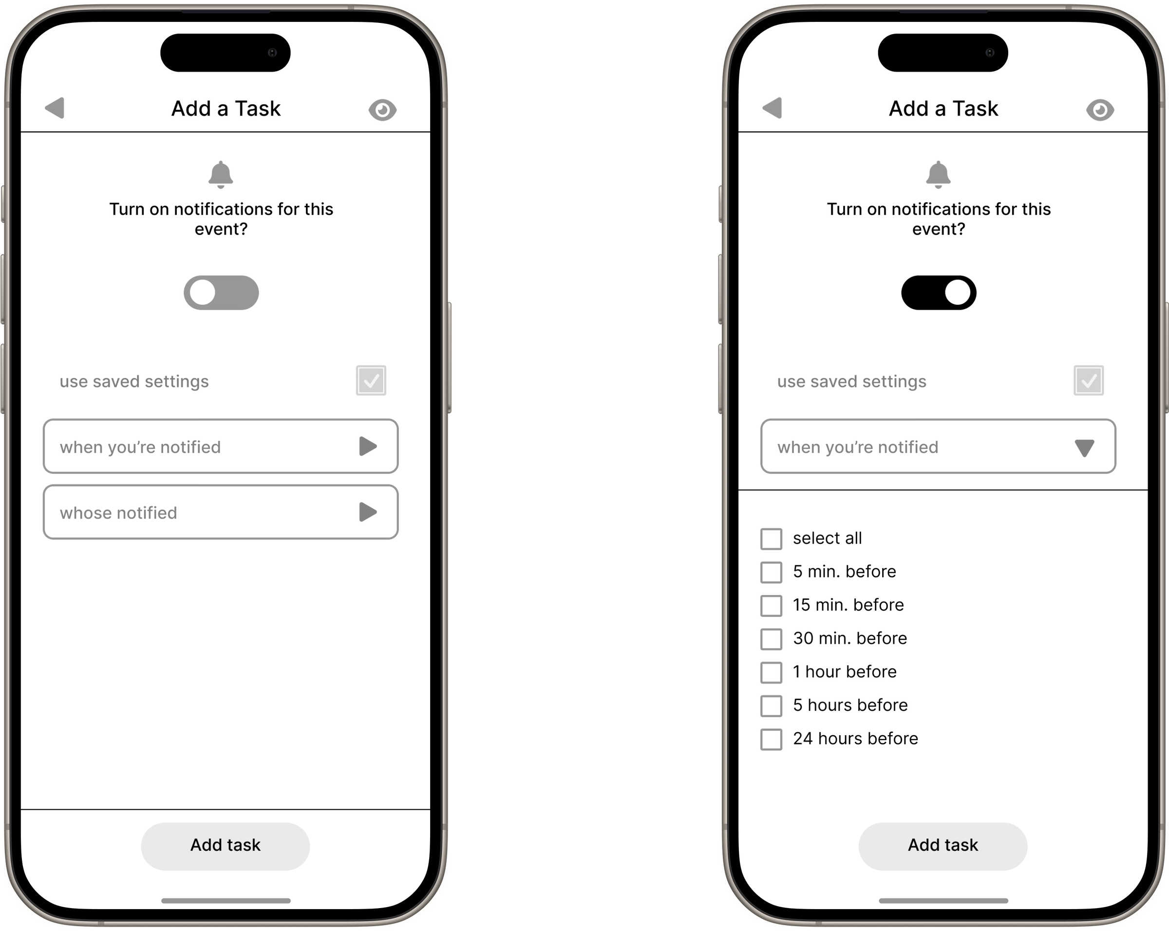
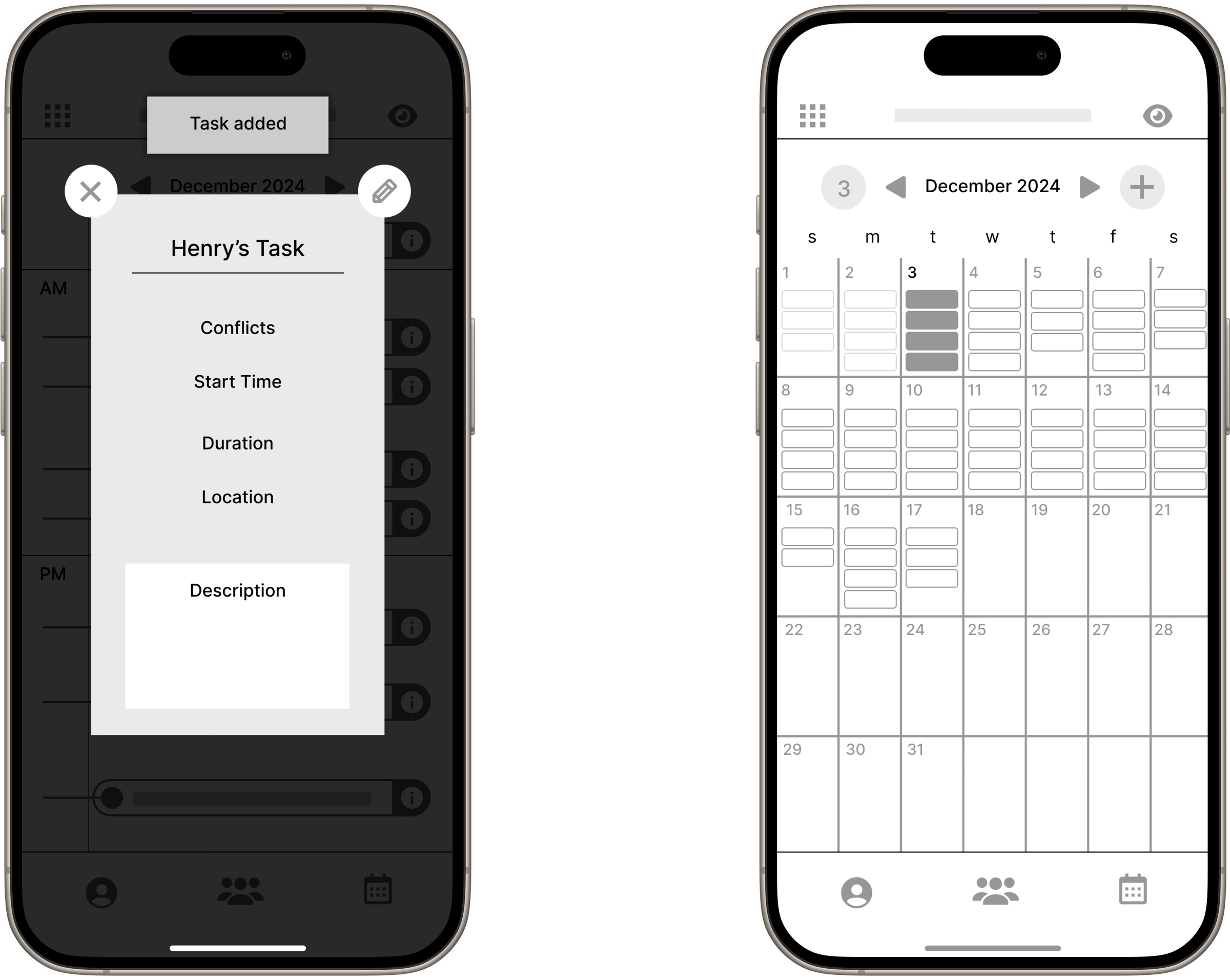
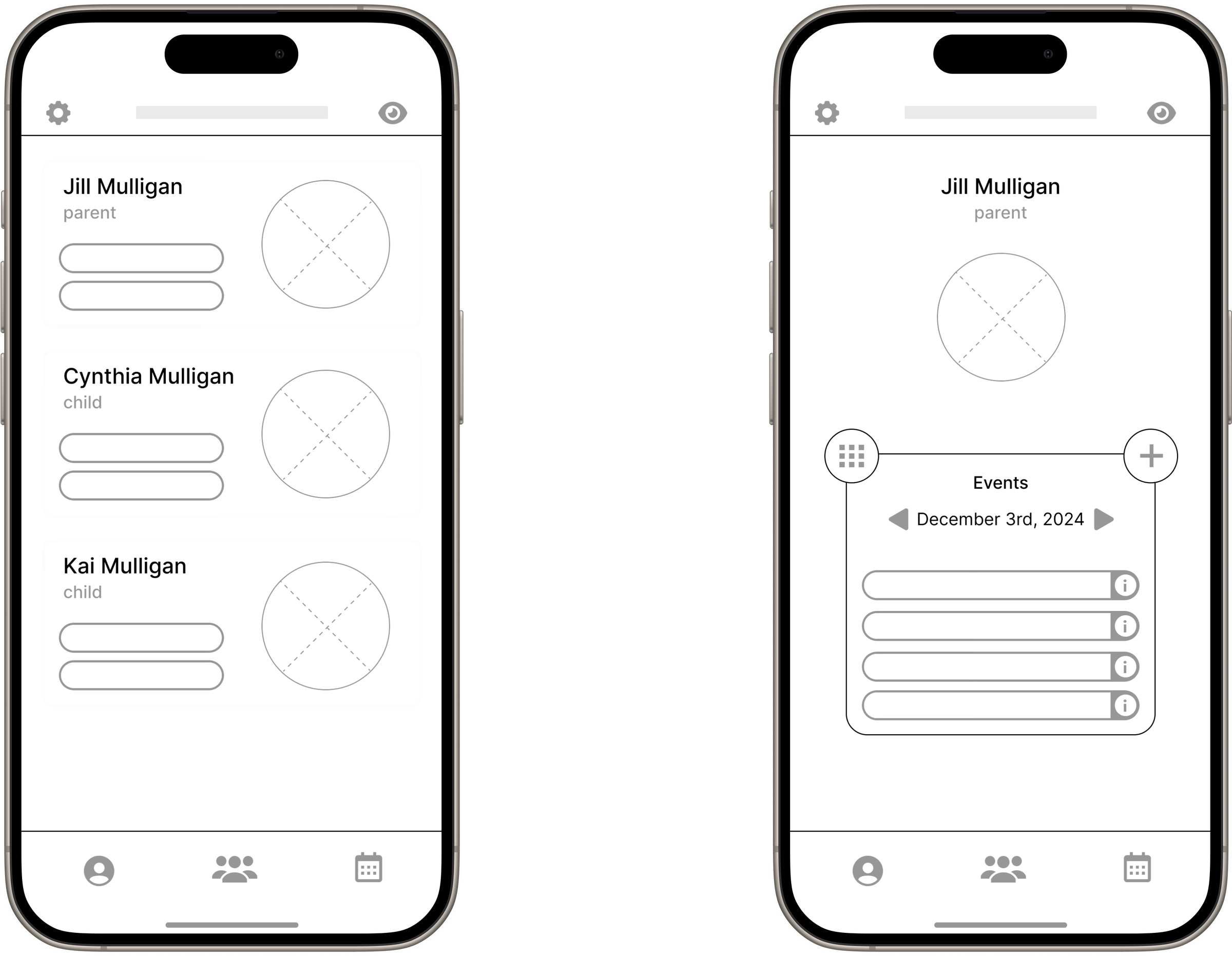
But we're not done yet!
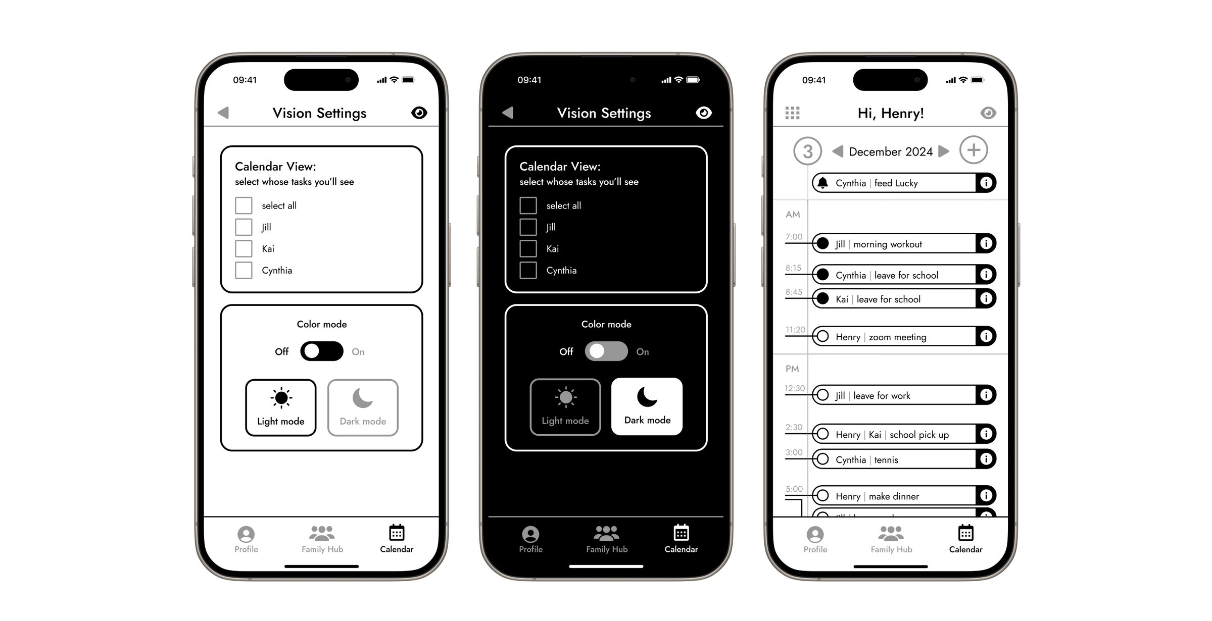
Addressing Challenges
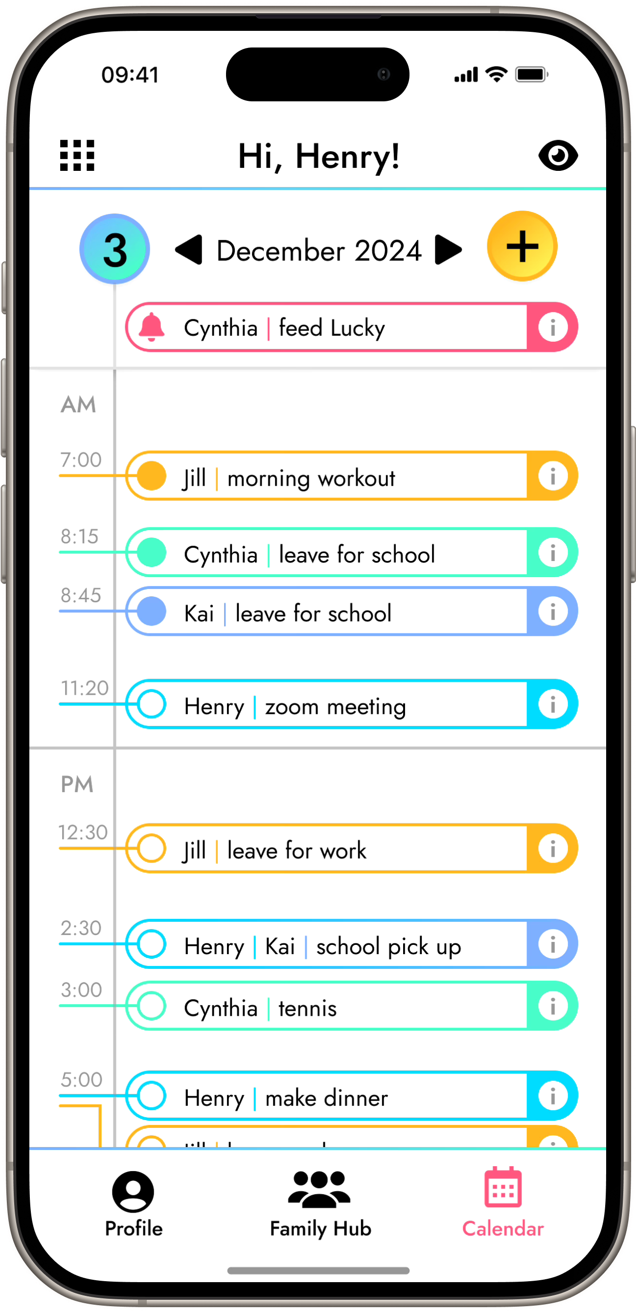
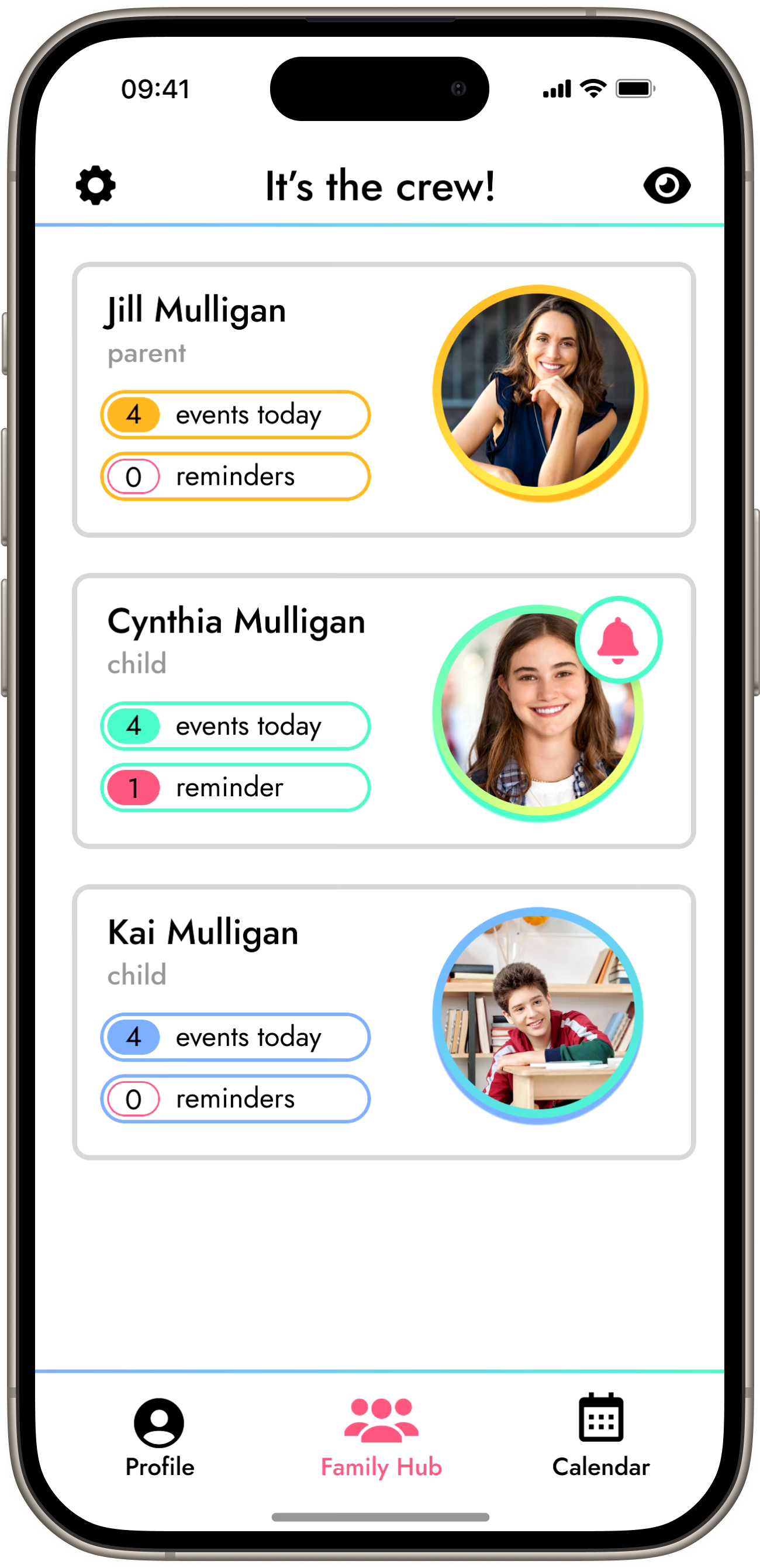
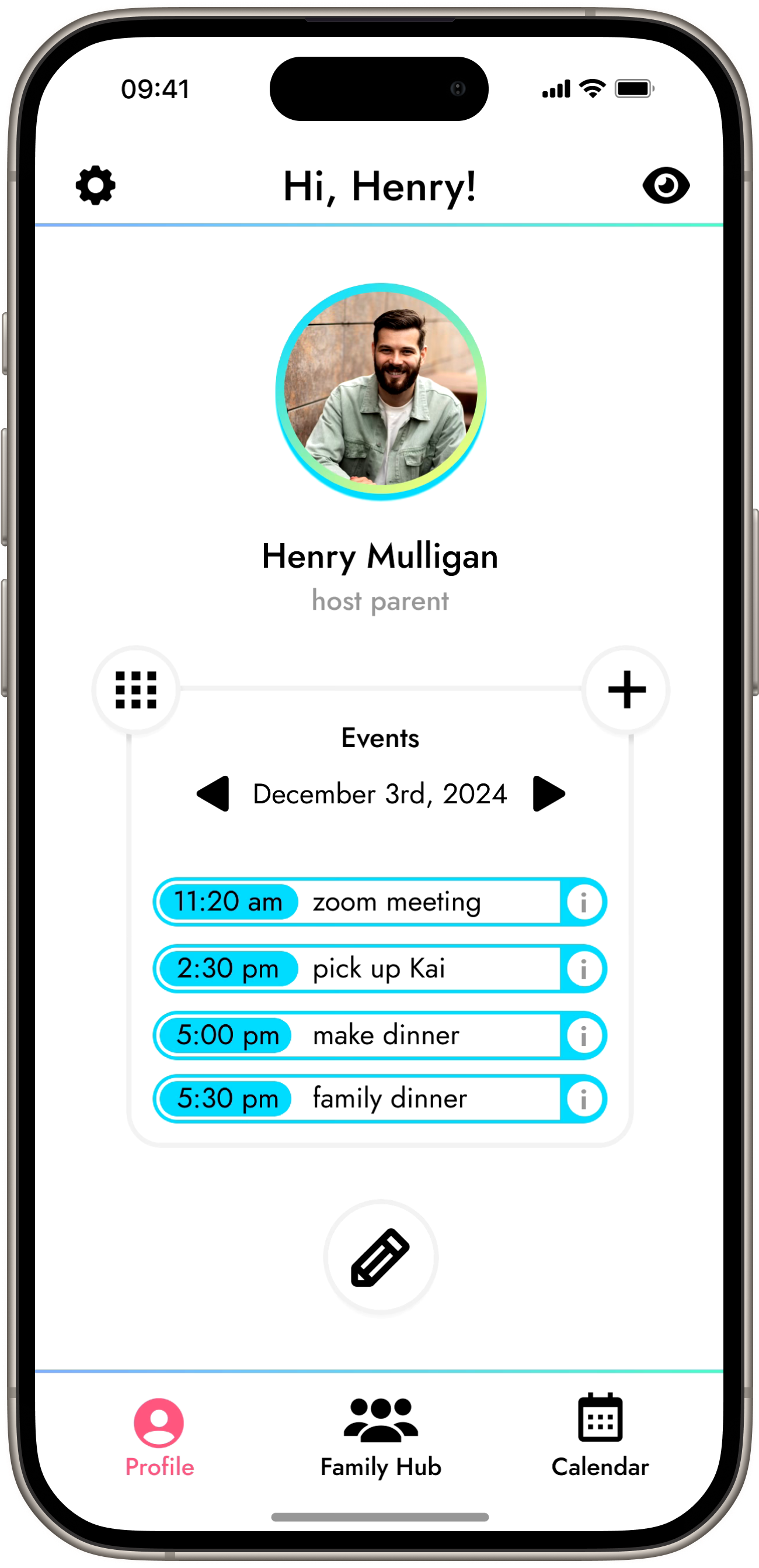
Style Guide
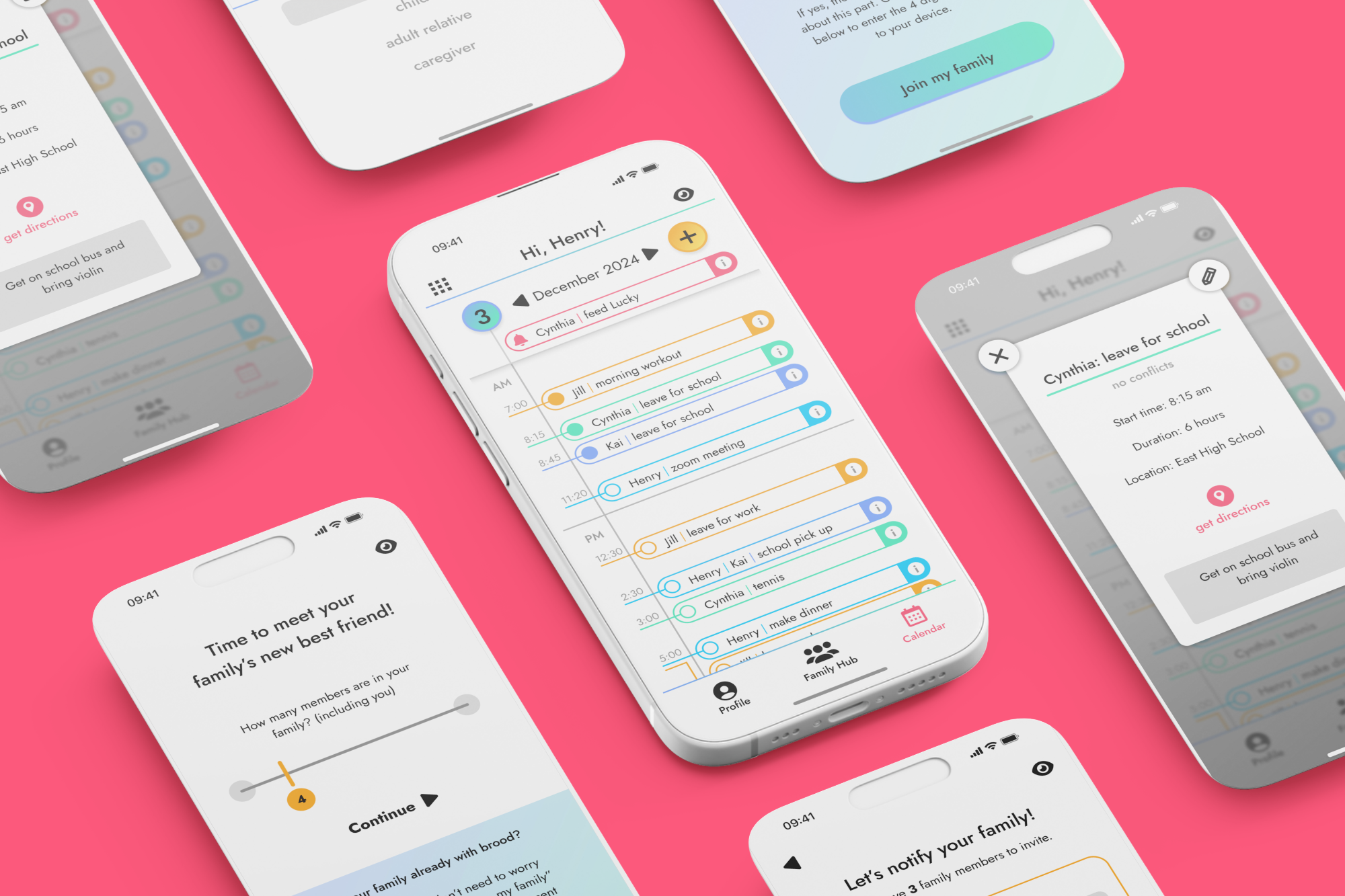
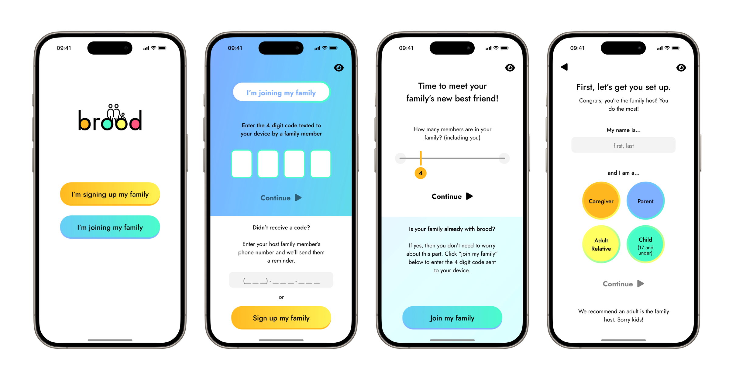
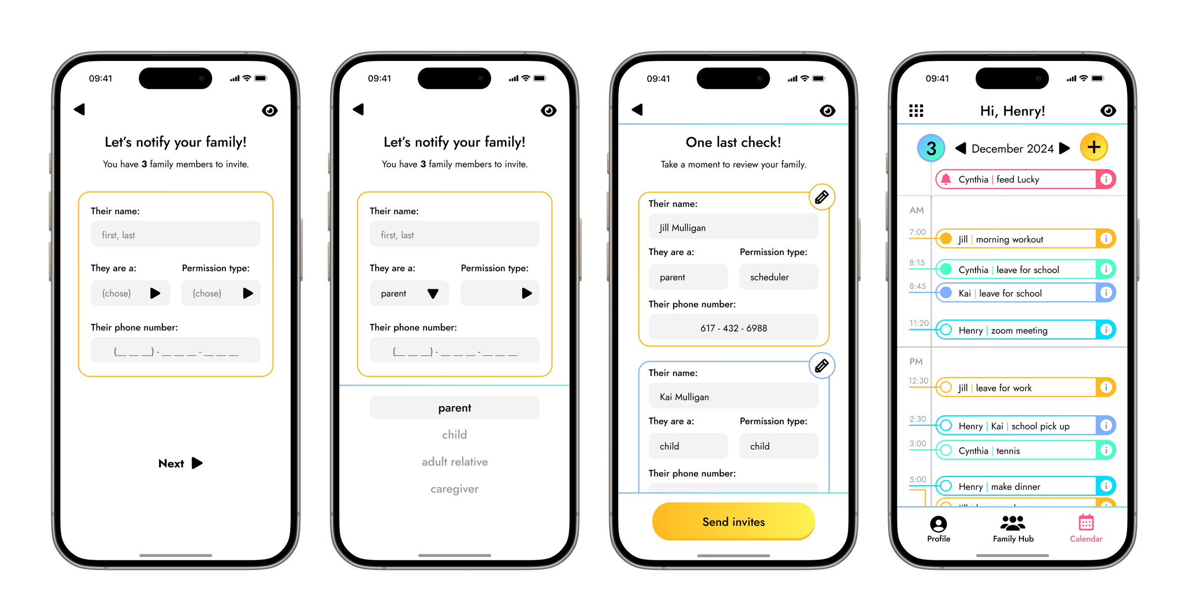
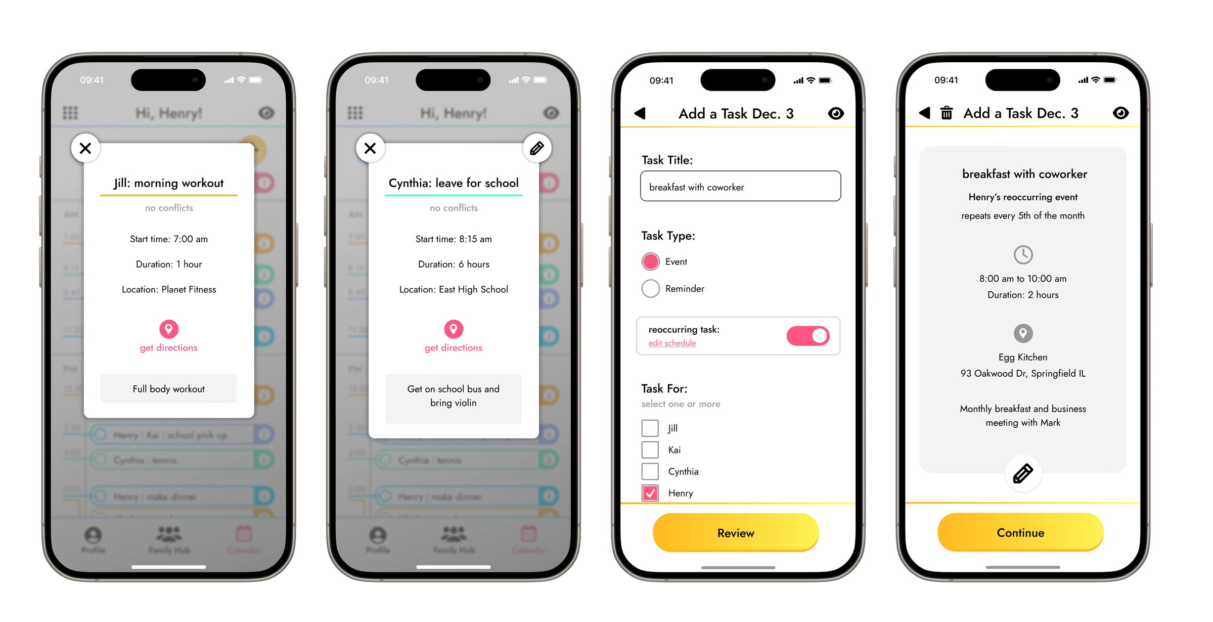
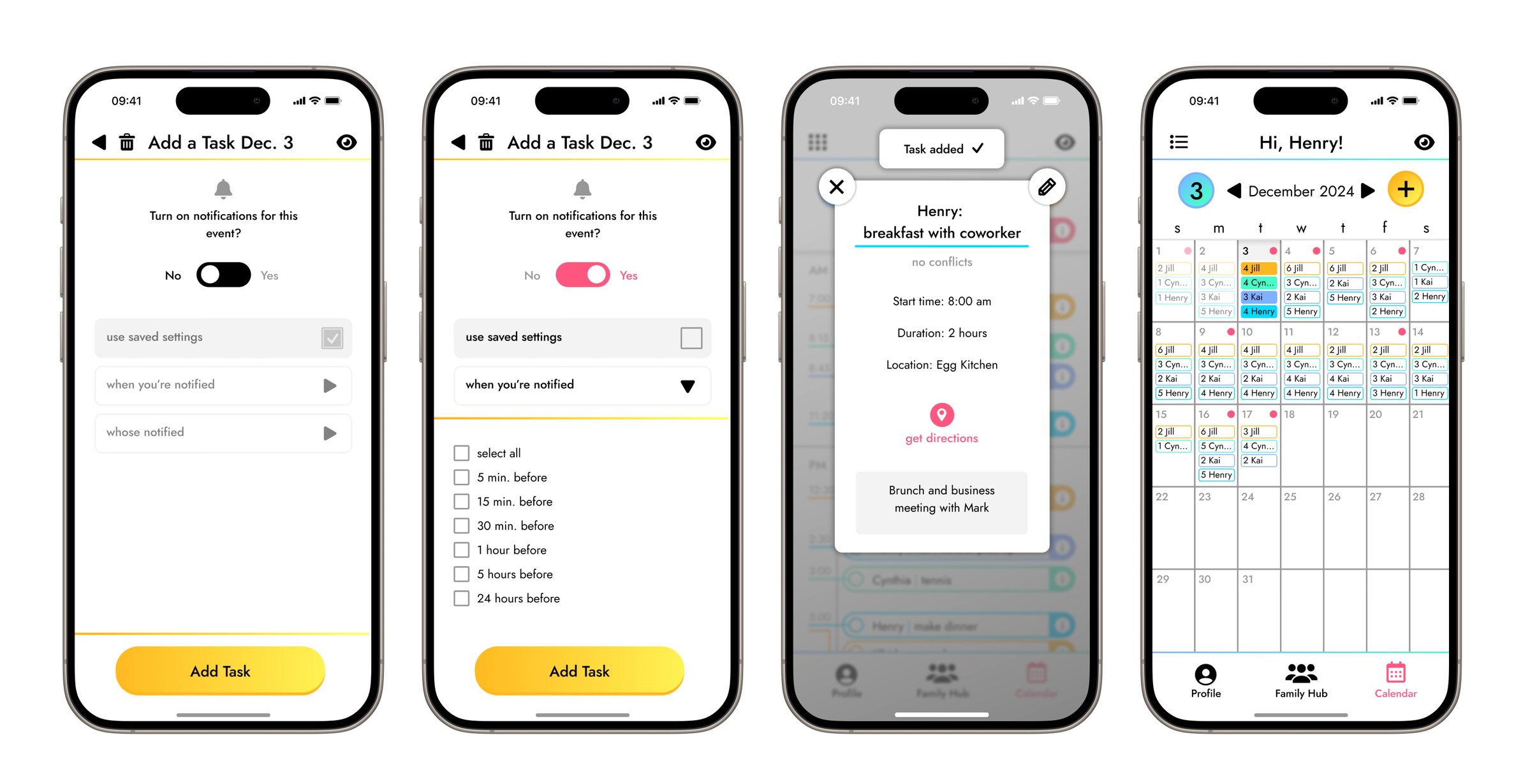
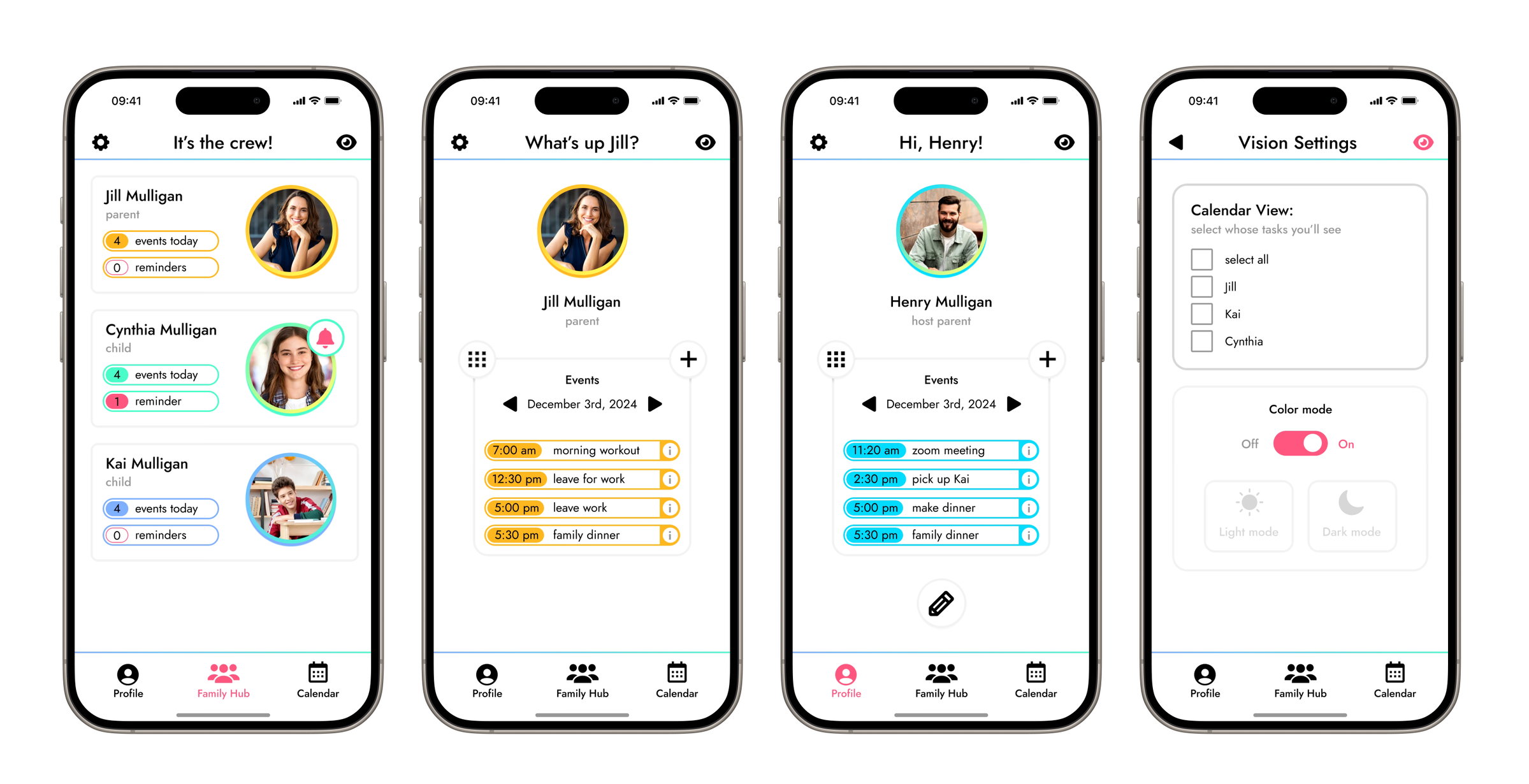
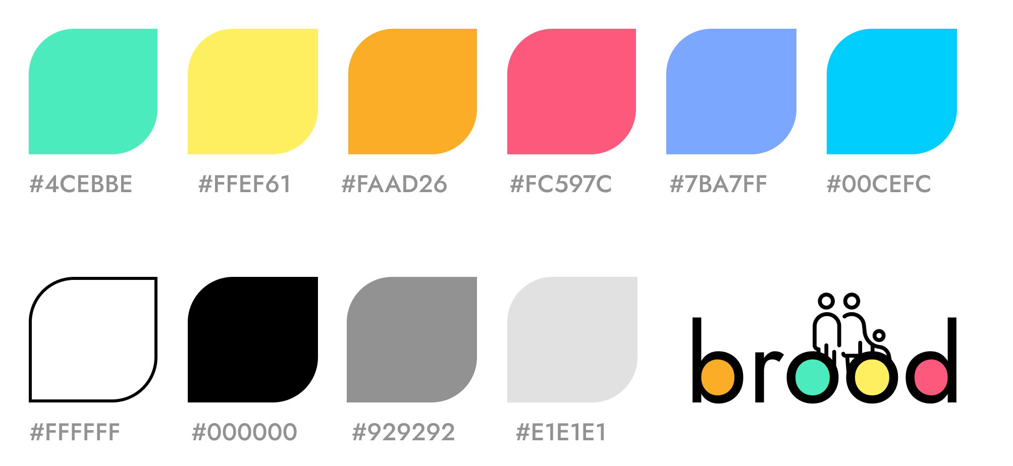
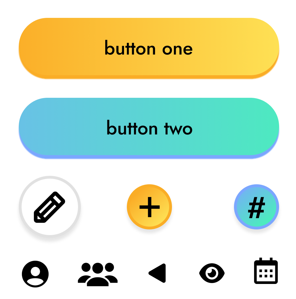
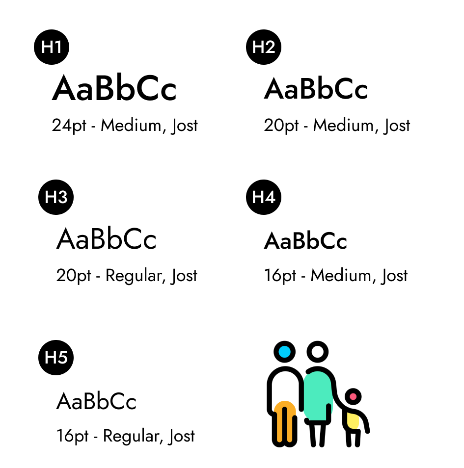
Brood's visual style relies on bright, fun pops of color balanced by white and gray neutrals to create both a sleek and playful look. Colorful gradient buttons with bold outlines direct users throughout the app, with pink used to highlight and capture user attention toward points of interest and selection. Large soft edge icons create a kid-friendly interface.
Final Designs